Here is one that several people mentioned would look nice: a piano key border.
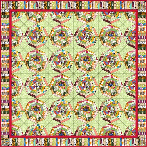
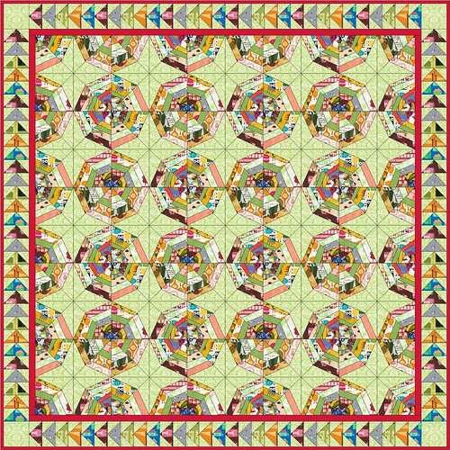
I quite liked the idea of a pieced border and mentioned that perhaps a border of flying geese would look nice.
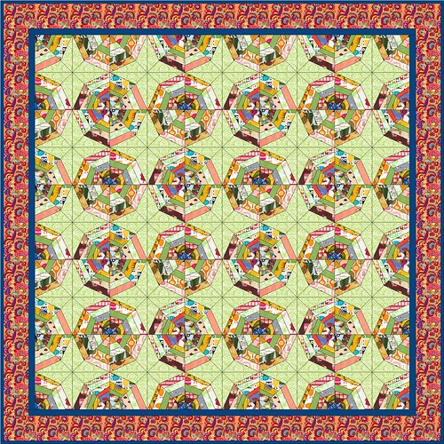
A border using a colourful Kaffe Fassett print was a common suggestion.
If I had more sitzfleisch I could finish up by adding more speeder web blocks. It looks good, but I don't think it's going to happen. Time to move on, y'all.
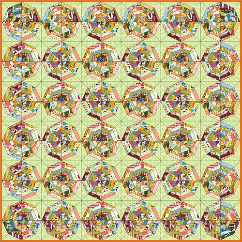
Another suggestion for a pieced border had the pieces lying horizontally, not vertically.
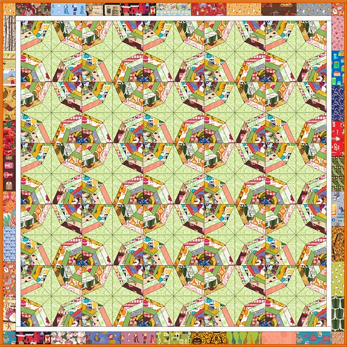
And in my post, I had said I was thinking that a low contrast border that gave the impression of extending the background would look nice. Funnily enough, this is my least favourite of all the ones Sandi worked up.
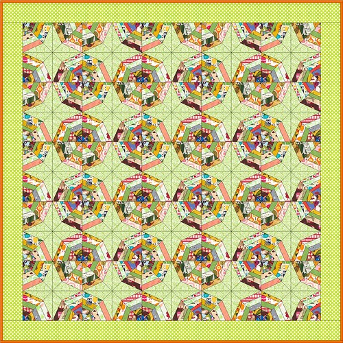
So, which one do you like most? Thanks, so much, Sandi, for going to all this work for me - it is so helpful to see them all laid out!
Also, today is the second anniversary of my blog! I am going to have a celebration, but I have not yet determined what form that will take. It won't happen until the beginning of October, because I have to survive this month of teaching. Our student teachers go out on practicum in October so I will be able to draw a breath and dig up some good-looking loot.





40 comments:
wow - that is very generous of her & very cool! I like the first the best - the piano keys. It kind of echos the rectangular strips found in the spider blocks. It'll be fun to see what you do!
Those are all great! I would go with the bright K. Fassett (or something similar) print with the skinny sashing in between. It is fast, easy, and those prints look fantastic, but the other options are all lovely. I sure wish there was a mac version of EQ.
Small red border with piano keys!! It rocks!!
I like the first border!
I know it's more work, but I really like your idea of the flying geese, especially if you use a fabric similar to your green print as the sky in the geese. It balances the webs well. My second choice would be the piano key border.
I'm glad that I could help!
Piano border all the way -- stunning.
Oh the piano keys for me!
Uh oh... I had a thought.
Don't hate me, but if you're open to piecing more spiderweb blocks, it could look really awesome with a different background around the outside. I added a couple more examples to the Flickr set.
I liked the Kaffe border.
I love the first with the piano keys! The solid red inner border grounds the quilt better than the others and the piano keys balance the movement of the beautiful center!
I love the first with the piano keys! The solid red inner border grounds the quilt better than the others and the piano keys balance the movement of the beautiful center!
I vote the 1st one with the piano keys!
geese
How nice to have these laid out. I am thinking that the piano keys with the red insert have it!
We all get by with a little help from our friends! They are all great, and see the different opinions? Quilters are fun. My favorite, you have already said ended up you least favorite. I think the green border made all your spiderweb work stand out....
:-}pokey
I like the piano key, flying geese, or pieced rectangle borders! More work to piece the border, but lovely when it's done. Your quilt is beautiful!
They all have their good points, but without looking at anyone else's response I think that all of the pieced borders draw your eye away from the overall affect of the wonderful blocks. So I liked the one fabric borders the most. I would probably go say something colorful like the Kaffe Fasset, but a lower contrast border might look really wonderful and emphasize the design if you choose the right color. Wow, that a really long and pompous opinion from someone who has only been quilting a couple of years, LOL. In all truth, this quilt will be gorgeous no matter how you finish it. One other thought...maybe a silly one, but perhaps a pieced border would accent it more if you put a small solid framing border in between. Some quilters like them some don't. For me, it depends on the quilt. Thanks for sharing all the great ideas with us. Please excuse my lack of quilting savvy, Hugs...
Wow...they all look great and how sweet your friend was to do this for you.
I like number 2 the best.
I suggested the Kaffe Fassett border, and I really like it in the mockup, but I also really really like the rectangular pieced border - for some reason it really speaks to me! Looks like I'm in the minority, though.... Whatever you pick will look wonderful, I'm sure, and what a great friend to do that for you!!
I like the piano key, but with corner accent squares like the geese example! Just like me to answer the question which one with a "this one, only not" answer!!
Love the spider webs either way!!!
Wow! It's amazing what you can do with EQ. It was so great of her to do that for you. I love the piano key border the best!!!
I absolutely love the piano keys borders. Having said that though, I like the flying geese as well, but I would do something with the corners, not leave them a solid piece of fabric. They pull my eyes to them, rather than accentuating the center of the quilt top.
No matter what you do, keep a thin, containment border around your spider web blocks. It provides a good resting spot for the eyes and a sense of continuity to the top.
the piano keys is pretty incredible, so that one definitely gets my vote! how fun to see all the options laid out. it really helps take some of the guess work out of it.
Yeah piano border for sure.
Lovely quilt btw!
I LOVE your spiderweb quilt. The colours in it are gorgeous. I like the Flying Geese border or the Kaffe Fassett one. Can't wait to see it all finished.
flying geese! (That has been my answer since I saw these in flickr.)
Love the piano keys the most! The Fasset print one is great too though (and LOTS easier/faster!)
My personal favorite is the border with the pieces lying horizontally. It complements the spiderwebs nicely but doesn't compete with them like the piano key border does (to my eye). It is going to be absolutely gorgeous when it is finished!
Wow, what a generous gift of Sandi! You have quite a selection to choose from and they all will be wonderful. Hmmm, I think my favorites are the flying geese followed by the piano keys.
There has been moping around our house as well missing our son. We have actually visited him the last three weekends using home football games as an excuse, but now have to wait for five weeks until the next visit....
I really like the second to last one.
Wow! I like the Piano Keys, or no border, or the border that extends the background color. Whatever you choose it's going to be fabulous! I love your spiderweb quilt!
WOW. I'm not a border person, but I really like picture #5! I think the fabrics are busy enough that they don't need to be cut up as small as the blocks have. Makes for more visual interest and balance when I scan through them all.
thanks for linking up!
~Monika
THANKS for posting a link on the Needle & Thread Network.
LOVELY quilt this is going to be for sure, I personally LOVE the piano key like border..
Look forward to seeing what you finally decide.
I'm voting twice. #5! #5! I think the piano keys make it wayyy too choppy.
I don't know if it's the rectangles that make it sing, or the thin white line, but the whole top comes forward from the outer border in that design, and it just makes me want to scoop it up and cuddle in it! ; )
~Monika
It's a toss up, but the piano border or the horizontal one catch my eye.
kaffee fasset for sure!
I vote for a plain border with perhaps a narrow border before a wider one. You can have fun quilting something spider-web like in the border.
My favorite would be the Kaffe Fasset, followed by the horizontal pieced border and then piano key border.
A belated happy blogiversary.
I think I'd choose the horizontal rectangles border.
I like the piano key. Kinda repeats the spidery feeling...
Post a Comment
Thanks for dropping by - I'd love to hear what you think, so please leave me a comment!