I mentioned in my last post that I have just marked my second year of blogging. I have been thinking lately about making a change to the look of my blog. One change is the name - while I do love Pickledish, when I started blogging I didn't realize that this is also the name of the home of Kansas City Star Quilt Co., They are a shop, not a blog, but I still feel it's a bit close for comfort. So while the url for this blog will stay the same (at least for the present), I have given this blog a new name - Stitch Literate. I like this name because it is descriptive of me as a quilter, and it also resonates to what I do in my day job as a researcher into reading development. And having just marked Rosh Hashanah, the Jewish new year, it seems like the perfect time to make a change.
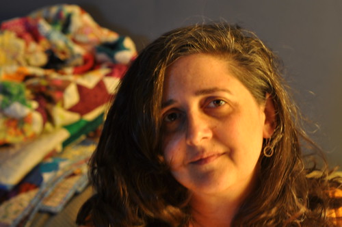
I'm still feeling my way around this blog makeover - and I'm not quite sure that all the parts are working properly. If you feel inclined, please leave me a comment to say you can see the changes I've made to the blog. If you like them, you can thank my talented and very creative doctoral student, Lindsay. And because every blog post should have a photo, I'm posting this one of me - I don't like having my photo taken but from time to time it's nice to put a face to a name.





17 comments:
hey you! cool new look.!
Looking nice. The font in your post was too tiny for me to read without going and grabbing my readers. :)
If there is anything on the left hand column below members, then I can't see it.
Have fun with your makeover!
I really like your new look. One thing though, I couldn't see how to comment from the main page. It was only when I clicked the title of the post, and the page reloaded, that I was able to comment.
Oh yeah, it says previous/next at the end of the post title line, I couldn't get that to work.
But otherwise I love the next clean look. Love it!!!
You should join the local quilt guild. I think you would bring a lot of inspiration to the guild. We have a meeting on Wednesday. What do you think??
Very nice new look and name Lesly. I agree with Cindy that the font is a little small and hard for me to read. So that would be my only suggestion :-)
Yay Lesly!! Nice, but ditto the small font, especially when reading it on an iPod!
Blessings!
I love the new look, but I have to second the small font comment. Also, only the right side of the screen scrolls. The left side shows as far as the first row of Members and that's it. I can tell there's more - the tops of the next row are barely visible - but can't access it.
The Previous/Next links work within each month - click on August and then click Next and it scrolls a tiny bit. Click it again and it scrolls so the next August post is at the top of the page, and so on. The home page only shows posts from the current month, so you have to click on the month (below) to see earlier posts. If that's what you intended, fine, of course!
All of your links - Archive, Flickr, Completed Quilts, Pages and buttons - are at the bottom of the right column, which makes them less accessible. People tend to stop scrolling when they reach the end of a post. Again, if that was your intent, never mind!
I really like the clean white background and the colors and fonts you chose for the header.
Precioso! me encantan los cambios! Te felicito por tu blog, por tus acolchados,y por tu hermosa hija.
Este lugar es una fuente de inspiración para mi.
Looks awesome Lesly! And I love the new name too. It just fits.
I love your new look, totally different from all the other blogs out there! Your makeover makes me realize I need to freshen my look a little too!
Thanks for the picture, I'm like you, hate to post pictures of myself online, but it IS nice to see you once in a while!
Whoa, fancy changes! I couldn't figure out how to comment aside from clicking on the post title immediately, but I'm a bit of a dunce. :) I like the new look!
First of all ...hey, Lesly, great to see you! I love the new title. The font is way to small for me ... you may want to have some buttons that will take you to a list of your features. I'd love to do that too, but I can't figure out how! :)
I really like the fresh look and the white background. Photos of quilts will look great against the white. Like some others, I too, can't see the left frame of the page below the first line of members (way better than "followers") and would appreciate a larger font. My other obeservation is that I prefer a page that includes a photo header.
And I can't believe how long your hair is!
It is great to put a face to the name! Everything looks good!
I like the new look -- very modern! I need to retool my blog look, and this gives me several ideas. Shana tova!
YOU look great and so does your blog. Luv the name. Very fitting. I also luv the fresh look. Font could be bigger, yes. Most times I read the main body so stuff at the bottom is okay as I can look if I want any history. Happy New Year
Thanks for sharing your pretty face. The new look is great, as is the name. You'll be as inspirational as always, I'm here whatever the name. :-}pokey
This is my first visit, so I'm afraid I don't know what it was like before :-) I like the name very much. Just wanted to say thanks for stopping by and for such kind words.
Post a Comment
Thanks for dropping by - I'd love to hear what you think, so please leave me a comment!