


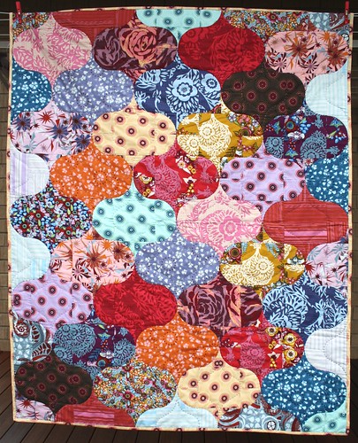
You may have seen the quilt in the photo above in the Fall Blogger's Quilt Festival lineup. It was one of my favourite quilts, made by Rebecca at Chasing Cottons. I bought the pattern as soon as I saw it, because curved piecing was on my quilting bucket list, and I figured I would damn well be an expert by the time I completed all the curves in this pattern. Well, friends, the time has come.
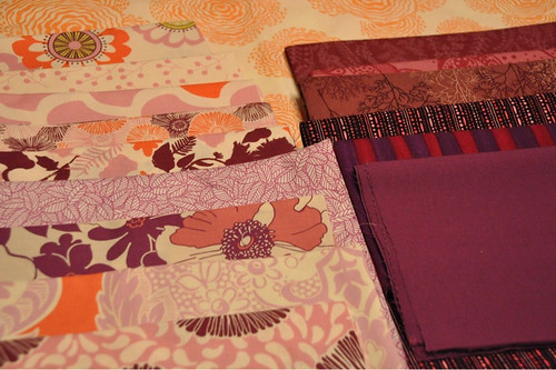
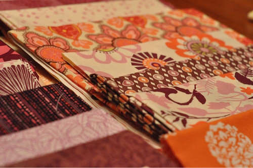
The pattern calls for 20 FQs. I bought a set of eight FQs from Liz Scott's Sugar Pop line. Jennifer and I had been talking about how nice orange and purple could look together, and when I saw this set I knew the time was right to jump in. This set has purple, orange and pink.
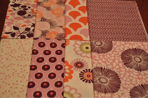
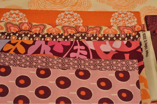
I went to my stash to find more fabric to add to make up the required amount of fabric, and here's where I need your help. I pulled more pinks, magentas, purples and oranges, but I want to make sure that I have a good range of values. I think having a range of lights through darks is really important when the colours are as close together as these are. So, what do you think? The Sugar Pops themselves don't have a huge range of values, so I was particularly looking for darker fabrics.
Here's what I came up with.
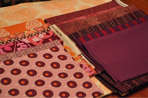
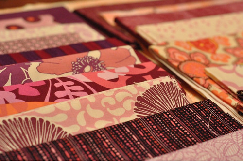
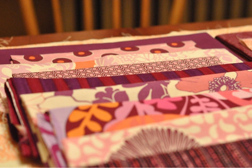
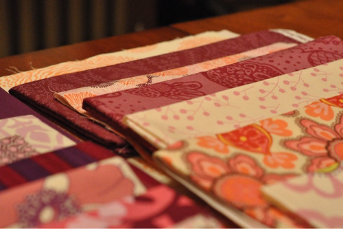
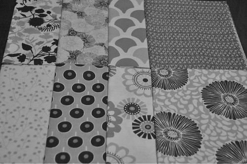
Here's the whole range. There are 21 different fabrics here, so one would be eliminated.
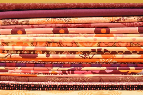
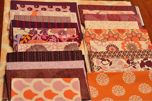
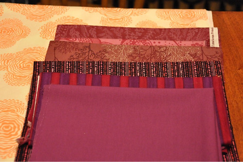
So what do you think - do these fabrics play nicely together? Do you think I have enough different values to avoid having this quilt look too same-y? If not, what direction should I go in? Do you feel like there is too much purple, orange or pink? Sing out!


16 comments:
I like the fabric you've chosen - everything seems to play nicely! It seems like there will be enough contrast - and the big prints will work nicely with Rebecca's pattern! Can't wait to see it finished!
looks great to me! at the most i would eliminate one of the medium purples. good luck on all those curves- you're a brave woman!
I don't think you can ever have too much pink, orange, and purple, and it seems like it will all work nicely together.
I LOVE those curves! I also really love the fabrics you've selected. I will say (because I'm always the one who says "maybe not" when everyone else is screaming yes, lol) that the one bold stripe kind of bugs me. I LIKE the bold stripe, but something about the red/maroon is bugging me. Like it's too bright or something. IDK, I'm totally novice, so I'm probably completely wrong. I can't wait to see how it comes out!
Oh, i think that it will be wonderful!!! Way to go for it!!!
Blessings,
KT
A really pretty design and really pretty fabrics. I would eliminate the stripe 5th from the top on the left if I was to eliminate one...
awesome! I also bought the pattern right after the festival and then dropped a large sum of money on "modern" fabrics (i chose plum, grey, pink & orange and about 1/3 solids-- when i'm home in NY i'll send a pic). I did up a test block and here's what I learned..
Rebecca's cutting directions have you wasting a LOT of fabric. if you don't care, cut away, if you do, just read that part carefully and adjust as needed.
the fabrics that you place next to one another need to have a lot of contrast (in my test block i was aiming for monochrome, but when i make the quilt i'm not). the instructions have you cut everything and lay it all out so you can see where you want things, which is a must for this quilt, but looking at your fabric selection again.. you may have too many light/mediums and not enough mediums/darks. I don't know if you're only going to have each fabric show up twice or if you have more, if you repeat some of the darker fabrics more often you probably won't have a problem.
I also think the wide red/purp stripe may cause issues because imo, it will be a pain in the neck to match the stripes with 9 patches for each curlique(and i wouldn't bother).
your quilt is going to be awesome and i love the fabrics you've chosen (esp the top ones on the pic of all darks). I'm hoping you can give me advice once you cut in and get sewing...
oh~ i see that rebecca didn't match stripes and has a few striped fabrics in there. well. what do I know? ;p
That is a wicked pattern!
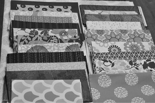
Thanks for including the black and white shots, that helps. When you look at the bottom shot it helps define things. To me you have a lot of lights and darks (9 and 8) and only a handful of medium tones. I would maybe swap out one each of the lights and darks to add in another medium tone or two. And personally, I wouldn't use that purple solid, it sticks out like a sore thumb. Then again, I'm never much of a solids fans.
Great colour palette! Luv it. This is hard to visualize so you probably need to cut it out and lay it down to see. It is looking like you could use more mediums which is odd because they are usually NOT the ones you need. I like solids but only one in a lot of prints sticks out unless it is binding or some such accent.
The fabric and pattern are great! If I was going to eliminate one fabric, it would probably be the purple solid. Normally, I am all for solids, but in this case, I think that when you finish you might dislike what your eye sees as a purple "blob"...sorry, that's an awful word, but I couldn't think of a better description. In your first picture of the fabrics, on the bottom row, third
from the left, there is a print with some lime green in it. Have you thought about adding a fabric with some of the lime in it? Not something completely lime, but something like Amy Butler - Daisy Chain line - Mosaic Rose or Amy Butler - Soul Blossoms - Joy Passion in Lily Mulberry. Those are the 2 from my stash that I would pull if I had your fabrics. Just enough lime to make the other purples POP! Happy Sewing!
ashley - ashleymjones@live.com
I'm looking forward to reading about your experience as it unfolds. Machine sewed curved piecing has always been a challenge for me, even after I bought a special curved-piecing foot 2 years ago.
As for your fabrics, I think there are two that seem very alike in value and colour, so maybe you'd want to trade out one of those. They are the second from the bottom in the left column and the top one in the right column.
Talk about auditioning fabrics! It's great that you have to lay out the whole thing before sewing because you'll be able to change your mind before investing sewing time.
I would say don't eliminate anything yet because sometimes that fabric that doesn't quite fit ends up making the finished quilt more interesting. However, I might play around with adding some smaller scale prints because a lot of the larger scale prints cut up in smaller pieces can look a little "mishy mashy". Maybe look at add some of Patricia Bravo
s blenders or even a shot cotton solid.
The b&w shots really help. I agree that the purple solid sticks out, and will probably be too distracting in the finished quilt. If you don't have (or don't want to buy) more mediums, then I think you'll just need to be careful in your layout so that you don't have too many darks or lights congretating in one spot. Otherwise, what a GREAT bunch of fabrics, and a really cool pattern. Have fun!!
"you had me at thanks..." lol
I'm on candy explosion overload while turning green with envy!
I'm drooling!
Post a Comment
Thanks for dropping by - I'd love to hear what you think, so please leave me a comment!