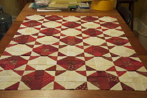
The photo above shows the blocks set out as they are in the book.

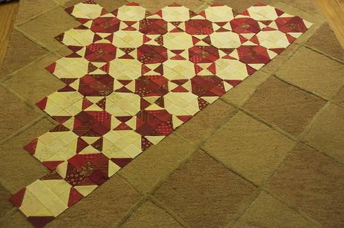
The photo just above here shows the blocks set out on point.
What do you think. Honestly, I thought I would like them set better on point, but now I'm not sure. The snowballs look more like boxes and less like snowballs. The jury's still out, though. What do you think? Leave me a comment to say which one you prefer and why.
The weather's nasty now, but on the weekend it was quite sunny, although fairly cool. Mr. Pickledish and I took Darla for a short walk down by Lake Ontario.

It was quite windy by the water, but there were plenty of ducks and seagulls, and people walking dogs (that's Mr. PD and Darla).

I snapped this lovely, public proposal. I hope she said Yes. Don't you?


17 comments:
Both are beautiful, but I love your red snowballs on point!
SewCalGal
www.sewcalgal.blogspot.com
PS - I hope you finish your top in time to enter it in my Virtual Christmas Quilt show, posted on my site. You just need to follow the rules and enter before Dec 25th to win prizes.
SewCalGal
www.sewcalgal.blogspot.com
well, I guess I'll say the first option...not on point. They're both great! how can you go wrong?
IMHO, definitely the first option - on point does weird things to that pattern... makes it look too checkers-y, highlighting the vertical & horizontal. The first option puts the focus on the diagonal, which is nicer.
I don't know, I see stars on point. I think I like that one better. What a lovely walk you had. Beautiful surroundings.
I thought your idea of setting the blocks on point was a great one, but now that I see the layout I think I favor the original one.
I love your proposal picture, how great, right place, right time AND your camera in tow.
I thought you should lay them on point, but now that I see it, I think it will look more like snowballs layed out the way the pattern says. I do like the stars it makes when on point, but the original layout looks better to me right now.
I love the proposal. I hope she said yes too!
I like the straight setting the best. It just looks a little off set on point.
Point fer sure, dude!
I hope she said yes!
i don't think our input is helping... i think both "point" and "not on point" are getting equal votes...
but i vote "not on point" anyway. i like the stars (like evening stars?) that show up with it square set. and i agree that on point it looks a bit boxy..
i hope he paints over it to tell us if she said yes!
also, not on point. i prefer the normal setting; is there a term for that? when they're on point they look like Ohio Stars, but since they're Snowballs, you should not put them on point.
Since you're soliciting opinions... my vote is for the striaght, original layout. To me, that makes the stars pop more than the version that's on point. Suzanna
I like them set on point because my eye draws into the red. Where as the other draws my eye in on the white. But thats just my bad ole eyes! And I do hope that woman said yes!
I like the first one, not on point. It just looks more like a simple snowball quilt to me that way. I would love to use some of my red scraps this way.
I like the straight setting. I agree, it makes the "snowballs" look more like "snowballs."
I like both versions ..... for my blocks I'm going with the pattern, but with a slight change around the outside.
I usually like everything better on point but I think I like the original version with row setting better on this one.
I totally agree with your assessment - not on point.
Post a Comment
Thanks for dropping by - I'd love to hear what you think, so please leave me a comment!