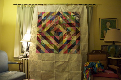
I'm so excited to show you my solution to the design wall problem. It's a bit McGyvered, but it's effective. I bought a flannel-backed, vinyl tablecloth at the grocery store and pinned it to my living room curtains. The folds in the vinyl are pretty pronounced, but it lays flat enough to do the job. Please ignore the SpongeBob fleece blanket on the chair to the right. I had originally planned to use that, since fleece holds blocks like a magnet, but I knew I couldn't overcome the distraction of those googly eyes. My daughter took that blanket to camp when she was nine, and we haven't managed to get rid of it yet.
I played around with some of the layouts that are possible with these blocks. Again, I have about twice as many blocks as are shown here.
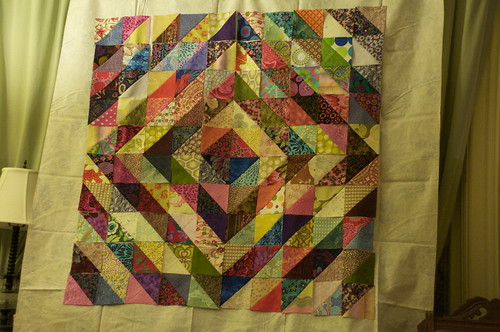
Here is a closer view of the one in the picture showing the design wall, #1 - it's the traditional, radiating diamonds layout.
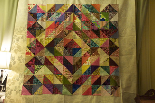
In #2, the radiating diamonds are bounded on the sides by small diamonds. More of the radiating diamonds would be complete in the full-sized quilt, and I think that may make it look less busy than it does right now. Busy in a bad way.
Here's #3, where there is one large diamond, surrounded by small diamonds. I think it looks less busy than the one above. I like the layout when the quilt is this size, but I think it might look off kilter when it's full-sized. When all the blocks are in, I suppose I could add another radiating diamond to keep the pattern balanced.
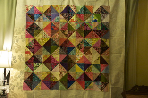
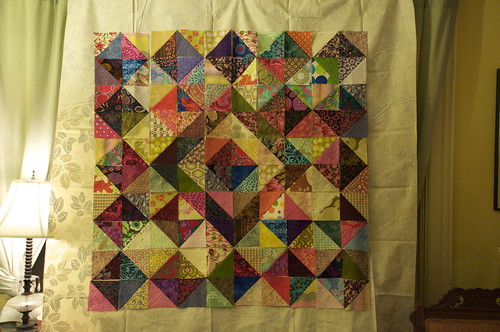
This is #4, the final option: small diamonds in an all-over pattern. I like this one, too. Decisions, decisions. Which one do you like?




9 comments:
I like no. 1 because I think the yellow really makes the design pop. I haven't figured out where to have a design wall, myself, so I have a "design bed" in our guest room. Not the same at all, but it works more or less.
I like No. 3. Not sure why, just like the way it feels.
I love #4.
Oh, my! They all look great! I really want to hate you just a little bit because I had sooooo much trouble getting mine to look halfway decent! I like number one and number three. Number one looks fantastic. The difference in value is apparent, but not too stark. I like number three because it looks great and seems more unusual. I don't recall ever seeing that design before. It looks great with the small number of blocks and would make a great wall hanging. I'm not sure how it would look on a larger size.... I have so much trouble visualizing these things unless I see them laid out. Not a very good trait for a quilter :(
Yes, 3 has some sort of pleasing eye motion in it. But they all look great.
I like no 1. It really shows off the value difference.
I like them all! Maybe you shhould make more than I.
Personally, I like #2. BUt if you have more blocks, what about making another diamond before you go into the smaller diamonds?
Oops, I meant #3.
Post a Comment
Thanks for dropping by - I'd love to hear what you think, so please leave me a comment!