


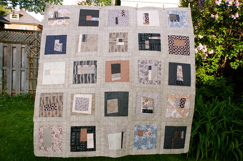
I learned two things about myself making this quilt. First, as much as I thought I would really like a quilt in a sophisticated palette of taupes, tans, and greys.... I really don't. I appreciate it on an intellectual level, but it doesn't call to me to wrap myself up in it. The second thing I learned is that I am really not an improv quilter. The first few blocks I made were fun and exciting, but as time went on, they became more and more of a chore. Like someone had a gun to my head, saying "Be creative with only these fabrics and only this style right now!" As a result, there are some blocks that are horrible, in my opinion. But I used them all because, after deciding I would go with a 5 x 5 layout, I couldn't force myself to make extra blocks to replace the horrible ones. I also recognized that if I did, the extra blocks would probably be horrible, too. I won't reveal which ones I think are horrible, but if you click through to Flickr and click on the "all sizes" button, you can see the blocks in greater detail and form your own opinion!
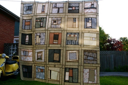
I love this photo of the back of the quilt top, with the sun shining through.
Thanks to all of you who helped me with various design decisions along the way. Here's one more question for you. I 'm thinking the back of this quilt should have some colour. What do you think?
(Updated to link to Sew and Tell over at Amy's - be sure to go see what marvelous things everyone else has done this week, plus another photo of Amy's new baby!!)


33 comments:
If you must do colour, I would do a deep blue matching the dark blue in the second from the top on the left hand side. And sperhaps a small slash or two of organge, but nothing too serious, again matching a colour in the top.
I agree with you--I love the look of quilts in neutral but constructing them is not one of life's pleasures, for me at least. But--I'm at a loss to find the two blocks you're unhappy with. I think they're all great! Blue for the back I think.
I think a bright yellow or orange back, maybe with a taupe border & taupe binding would add some pizzazz without ruining the aesthetic of the front.
I like the idea of a blue or dark grey.
But to keep the quilt's front and back balanced, I'm thinking chosing something similar to the lighter colors on the front of the quilt...like the taupe or flesh color (at least that's what they look like on my screen.
Even that green you thought about using for the sashing might work.
I look forward to seeing what you decide.
Hmm, I think a terracotta back would look fabulous. And you know, there are no laws about the size of a lap quilt so next time make it whatever size suits you.
1. "more and more of a chore" so so so glad that I am not the only one who feels this way! (I have been clipping flickr photos of "simple Improv" piecing so that I can copy them. - More of an "oh I can add an inch of red here" guide than anything else - a reminder...)
2. Definately use a neutral for the back. (Or a red - that just came to me, not scarlet more of a claret)
3. Simple quilting - stipple or loops. Anything fancy would get lost & anything super angular might clash... thread to match the sashing.
3. brown binding...
You didn't ask for all of that, did you... :o)
I like the fabric in the 3rd row down and 4th block over. It looks like it would be good for a back...has lots of movement.
two words:
electric
blue
#1 - I like this quilt a lot. I like the shapes and textures.
#2 - I'd go with something unexpected and fun on the back i.e., Moda has with scissors in white on a black background, it's called "Half Moon Scissors Galore".
The way I am seeing the colours, I'd do the blue grey with 2 narrow strips of the coppery coloured fabric running the length of the back. Then I'd stack some leftover fabrics between them.
I also struggle with this whole improvisational thing and really liking the finished product. So I'm trying to figure out how to balance the improvise and the traditional but still 'make it mine'. Here's hoping! 8^)
It's funny, when looking at the picture, how much blue-ish and orange-ish I see in the neutrals.
Despite that, I say RED all the way for the back. I think a nice semi-deep red somewhere between a brick and a muted cherry would be really striking. I'm going to go over to flickr and comment on the individual blocks.
Improv isn't for everyone. But keep in mind, that there are loads of ways to approach improv and lots of block styles you can get out of it.
As for the back, I'm leaning towards an orangy/copper colour, maybe with a touch of blue.
Lesly, I also love the look of the back side of the quilt with the sun shining through! I'd say go with some color on the back, especially if you aren't in love with the front (although I think it is great) and have fun with it.
I always like those kind of quilts, and I've made a few of them. but I don't make a color scheme for the blocks. Your quilt is very interesting
I have to admit I feel the same way about improv quilting. I fret about the fine line between creativity and thrown together.
I agree with Metanoia. Deep blue with a splash of a bright would be a nice flip side.
I don't have any advice on the color for the back, simply because I don't think I'm seeing a true representation of your colors..Your tans look very dark peach/terra cotta on my screen. But I will say that I love your flimsy..and agree about the picture from the back.
Looks great! I see the dilema...I'm going to go with a yellow, I think it would look so great and compliment well without taking away from the front.
Isn't it amazing what we learn when we quilt? You did a great job on the improv blocks! I like the overall look of it, and I think Metanoia's idea for the backing sounds good, but just go with your gut and something you really like.
You can always leave it at my house! 'Cause I like it! Of course, you need to finish it with a beautiful pumpkin or red color!
Way to stick to it!!! It is beautiful! I am a firm beleiver of making what you love. Sorry I am no help in choosing a background. I really need to "be there" to help. I'v got a whole visual/tactile thing going on!! I would suggest a print.
Blessings,
KT
i love to see a quilt like that in the sunlight...it looks like stained glass. i love this. despite its subtle colors it really has life.
Well, I can appreciate learning those things about oneself! I like the quilt on the same level as you, intellectually but I need cheerful colors when I'm cuddling in a quilt. They lift my spirits. :)
Still, you did a very good job in completing it and once you quilt it, I hope you will like it even more.
Your quilt top is quite lovely...some of the blocks are simply wonderful!
I have to say I'm definitely not into improv...I once made some wocky star blocks for a charity quilt and they were not easy for me (and they weren't very wonky either!)
Actually Lesly, it's a beautiful quilt, and I know of some people who would absolutely rave over the color scheme. Me? I'm a multi-color person too, and I think you're feeling a bit starved so that's why you want to put some color on the back. Not sure if that's appropriate or not. Maybe some of the more fashion-conscious here can give you some advice.
I think it's great that you tried to stretch yourself though. Sometimes a quilter finds some really good new color schemes or techniques that way. And in this case, you've found that this color scheme isn't for you.
Beautiful! I know you didn't like how close the seams were to the edge on some blocks, but this really came out wonderful. I can't do random so I am always amazed at these modern quilts! If you don't like the front, make the back more you!
I really love the overall effect of this quilt but I'm pretty sure I'd be like you and get bored making it. It is going to look lovely finished though. I also think that perhaps you should match to a colour in the top for the backing but perhaps go for a brighter shade. Love the stained glass look in the second photo!
I understand how you feel about the colors you used. But I find them to be refreshing from brights. Don't get me wrong, I love the brights. Neutrals are just a good change once in a while.
The improve is not really for me either! It take too much brain power and I do better following a pattern where all the math has been figured out for me.
I still think your quilt top is pretty! :o)
It's beautiful, but I know what you mean! I think a little color on the back would be cool, but I'd keep it mostly neutral.
I know what you mean--I made a wedding quilt in creams--very challenging to finish because it was so neutral. I'd stay neutral for the back, but there are lots of beautiful taupe prints outs there--tone on tone would be lovely. Now you can say you've done it--and well!
well, I like your quilt!! You did a great job, plugging away even when you weren't having as much fun. It's lovely.
Lesly, it sounds like we have similar personalities with projects. It's a beautiful quilt, though, even with the more subdued colors. By the way, I really like the way it looks from behind with the sun shining through, too!
I can commiserate with you about working with colors out of your comfort zone - I do quilts for a quilt ministry at church and sometimes the recipient is much more "country" than I am - and I'm not fond of those country colors together. (I like brights usually!) BUT your quilt yis absolutely stunning, and I can see how it would be very calming and zen-like.... I love it! As cool as the colors are on the front, I would go for a "warm" color on the back - maybe a terracotta, which looks like it would be an echo of some of the blocks on the front. Lovely quilt - if you find it hard to finish, you could send it my way!!!
i just love this quilt...and i love the cross weave fabric you used as sashing. can you give me some info? brand? shop?
Post a Comment
Thanks for dropping by - I'd love to hear what you think, so please leave me a comment!